

ILoveZao
-
Content Count
811 -
Joined
-
Last visited
Posts posted by ILoveZao
-
-
Sorry to hear that news Chriselle.
Gambatte, Ti-kun!
-
I wish there were more places closer to Zao; it's a bit isolated in a way which I think puts some people off.
-
Saw your two reports MO.
Very nice, thank you for sharing them.
I am usually really busy this time of year and never seem to get over there. I think I'd like to go when it first opens.
-
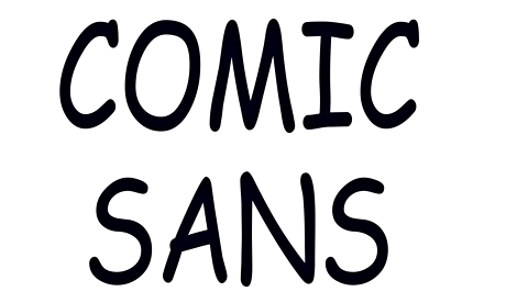
Love it or hate it, the Comic Sans typeface makes amateur typographers of us all. Now a new version has appeared, promising to lend credibility to the comic line of typefaces.
Comic Neue, designed by Craig Rozynski, is like Comic Sans but has been designed with some key differences that are supposed to make it less unsightly. Rozynski says on his website that the typeface "aspires to be the casual script choice for everyone including the typographically savvy". Do we really need another comic script though? Was Comic Sans really that bad in the first place?
If you have been near a computer in the past 20 years, you have likely encountered Comic Sans, the "fun" typeface with rounded edges that appears to be written with a felt-tipped pen. If you are an amateur designer, it's the go-to typeface for just about any occasion that requires a relaxed approach. If you are an experienced designer, it's the last typeface you'd ever use, unless you want to be ridiculed without mercy.
Comic Sans, now approaching its 20th anniversary, was originally designed by Vincent Connare for Microsoft Bob, Microsoft's 1995 interface for various iterations of Windows. Microsoft Bob came with a dog that would interact with the user. In the initial version of Bob, the dog offered assistance in speech bubbles using Times New Roman. Connare decided that comic dogs probably wouldn't "speak" that way, and went to work designing something more interesting. He used the hand-drawn characters found in popular comic books like The Dark Knight Returns and the Watchmen series as inspiration for what would later become Comic Sans.
Since then, the typeface has been used for everything from physics presentations to papal documents and its popularity is only matched by the disdain some people have for it. People feel so strongly about Comic Sans that there is even a website devoted to banning it entirely. It is this ridicule that prompted Craig Rozynski to redesign the typeface into the new Comic Neue.
-
Looking forward to the 4 day long weekend though.
-
Key points:
40 seconds, first serious warning flag.
43 seconds, MASSIVE red flag.
47 seconds, why the hell did he turn away from the line he was on to the OBVIOUSLY far more exposed (even if you cant see the landing) and dangerous drop? I know there was a couple of trees he was turning from, but he had time to get back on his line once he saw the drop and realised he couldnt stop.
47 seconds, commit to the landing or youre going to eat serious shit.
There we go. Its a good educational lesson

For sure.
Didn't have any worrying situations this year.
But perhaps that is me getting a bit older and not pushing.
-
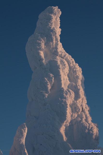
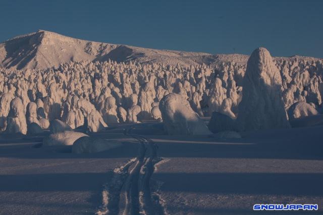
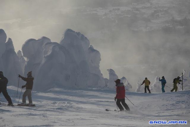
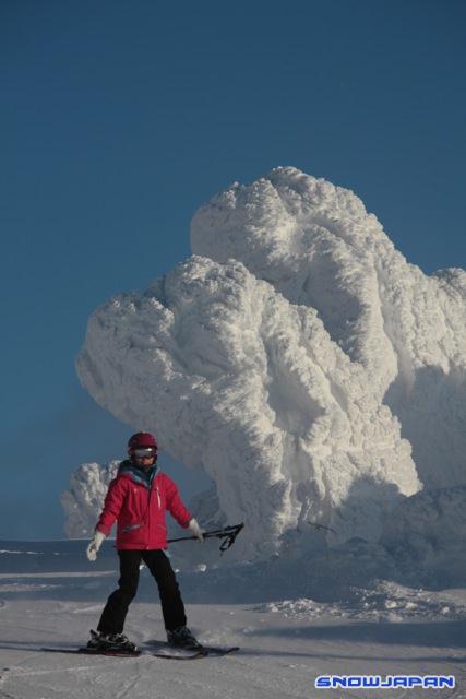
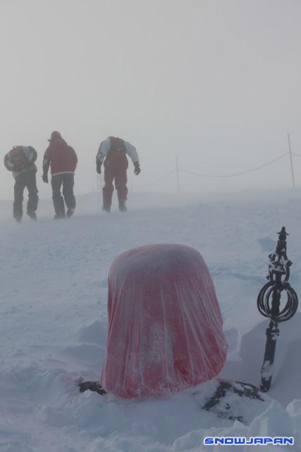
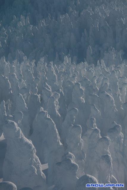
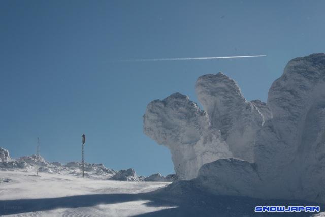
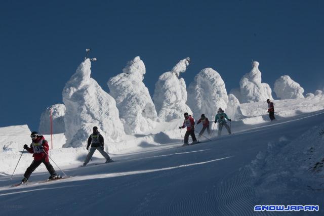
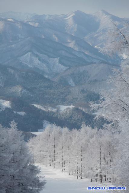
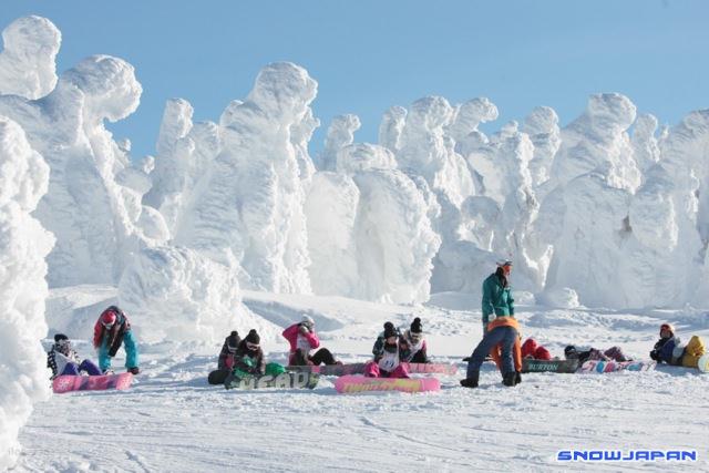
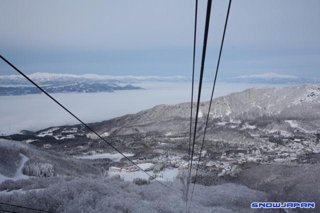
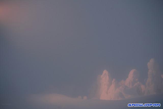
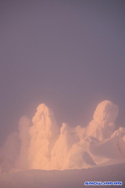
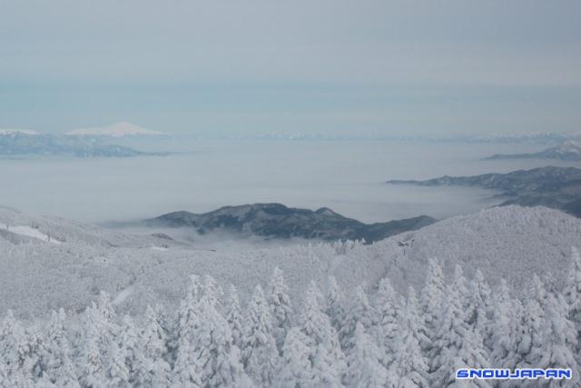
Zao has had an interesting and somewhat odd season.
Lots of snow later on, the monsters were rained on in early February but made an impressive come back.
The snow has stuck around for longer than usual.
-
But most of those were half days.
-
Probably just under 50.
-
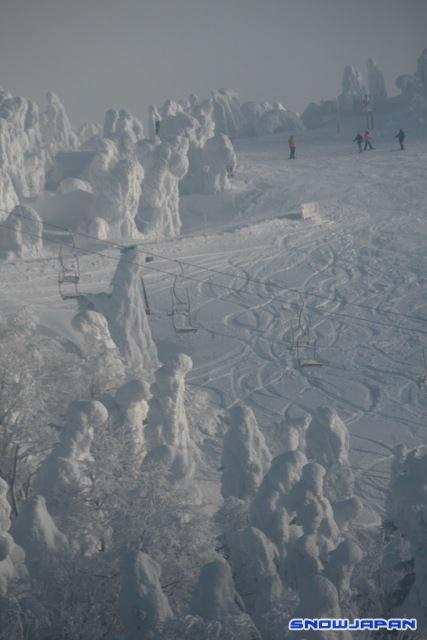
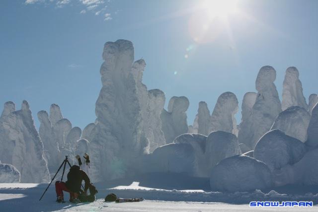
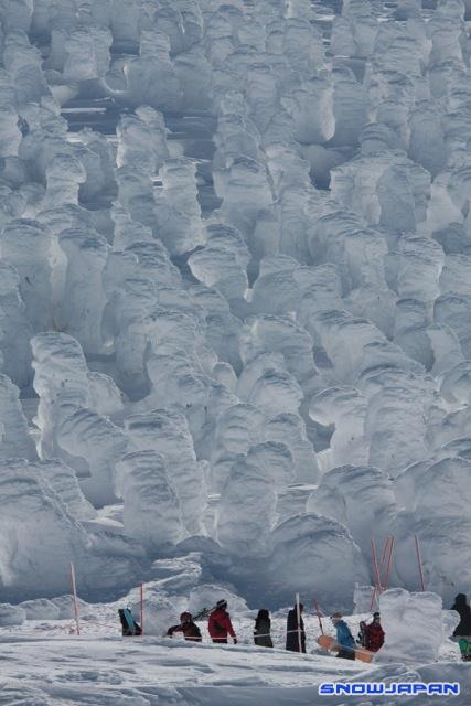
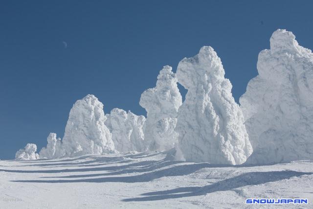
Monsters have recovered a bit actually.
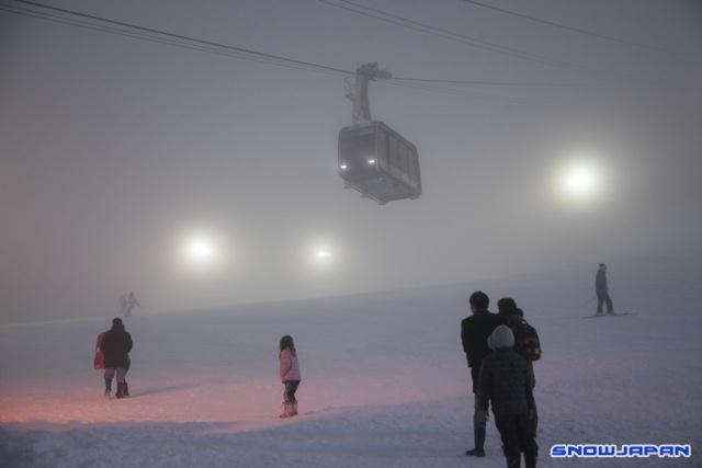
It's not fun up there when there's huge winds even if the ropeway is open. Best to try and come when nicer weather is forecast -- if you can, of course.
-
Born close to ski lifts so it was easy for me. Wasn't atually my choice, come to think of it!
-
I very much dislike people who cover up the bad bits, lie about things and just go over the top with everything being epic - when it isn't.
Great to be excited when it is.
-
....and do some ski jumping as well!
I heard Tubby was always up on that ski jump flying off come evening time.
-
That's not good at all, is it.

-
If you are there for a month, buying skis might be worth thinking about.
-
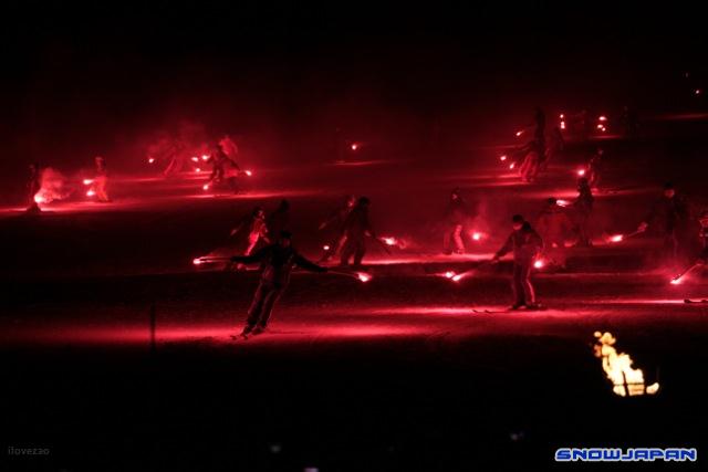
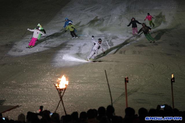
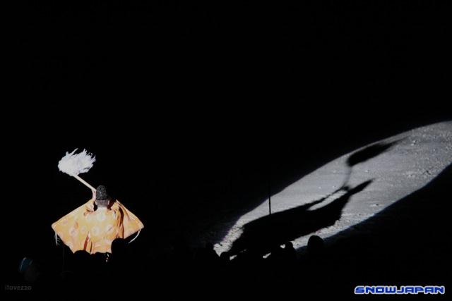
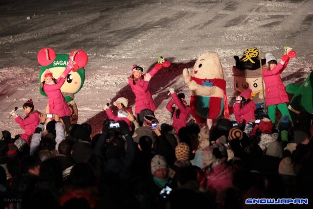
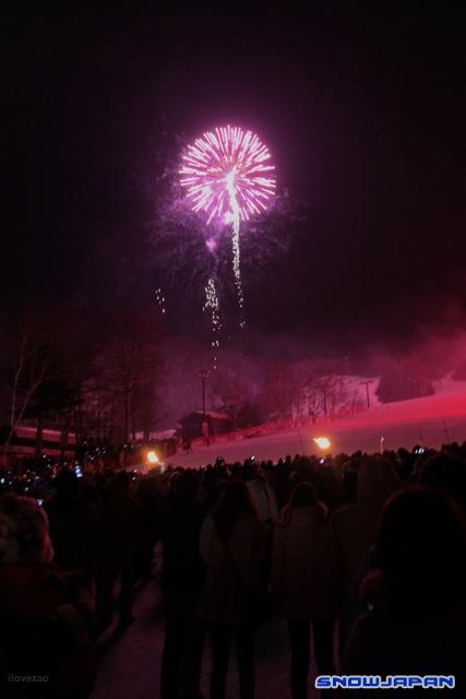
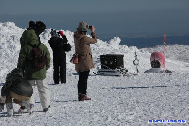
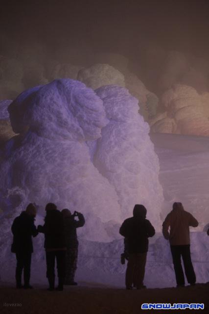
Festival last weekend
-
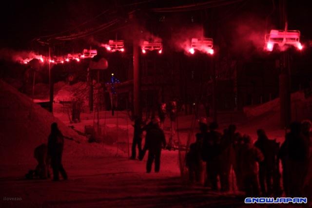
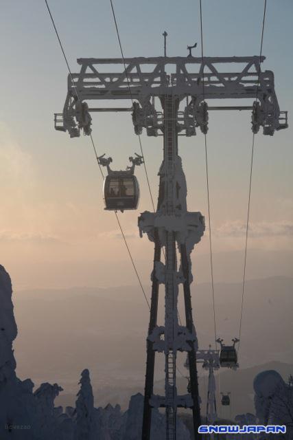
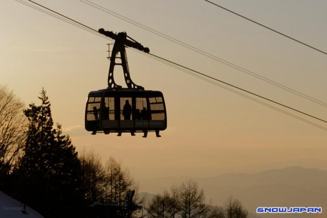
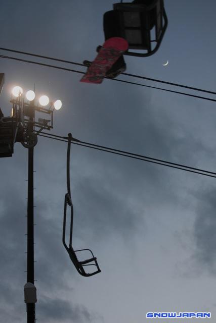
Double pair lift working.
Either - weekend or an old photo!

Hmm but need more than that.
-
Here's some more:
-
I like the 'bunch of mikes' they hold.
-
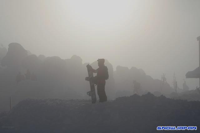
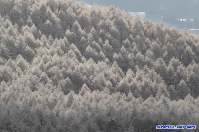
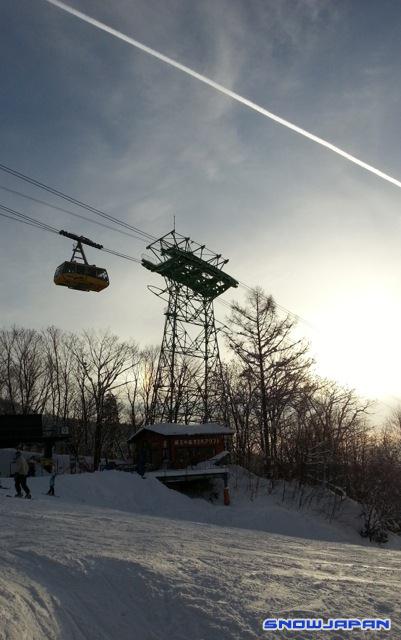
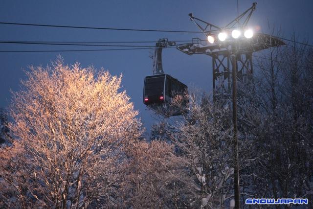
A few new photos
-
Yes they are coming on good this year
-
Well, no.
People automatically assume that people who have ski accidents are skiing fast. That is probably borne out with skiing accident statistics (guess!)
So it seems a reasonable comment to me.
-
-
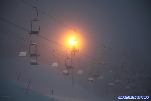
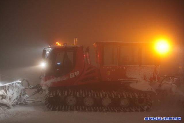
Some new ones.
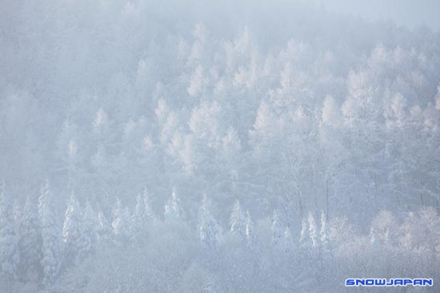
We got some nice snow the other day, making it a good start to the season.


Guess which Japanese ski resort gets the most page views on SnowJapan
in Snow talk, trip reports, Japan avalanche & backcountry
Posted
Good to see Zao up there!