
nzlegend
-
Content Count
2864 -
Joined
-
Last visited
Posts posted by nzlegend
-
-
LDP is getting an epic spanking! Legacy politicians who couldn't organize a pissup at a brewery and they ran this country for decades. Finally the public reached their limits and called for change.
lets hope the DPJ do a better job -they cant possibly do any worse....Taro Aso don't let the door hit your ass on the way out mate....Old losers should retire and give their money to poor young men so they can get married* ;-)
*reference to his stupid gaffe the other day
-
Well, normally I watch the impending winter with interest, sadly this year will be a complete zero for me. It over before it even started (due to a recent knee reconstruction - winter 09/10 will come around too soon for me).
Anyway don't want to kill the vibe too much in this thread, so it's sayonara 09/10 season from me....


-
19.19! Damn!
-
Originally Posted By: Mamabear
Mars Bar Crunchie Slice
Enjoy.
Enjoy becoming a metabo....
deep fried Moro* bars have been around in NZ since I was a kid.
*Made by Cadbury, Popular in NZ, like a Mars Bar but better. -
I have heard the name Shonan Beach many times but until now didnt realize what a disgusting place it is.
Are young Kanto people are really that lazy and selfish?, makes me glad I live in Kansai. Shirahama Golden sand beach looks saintly compared to that pigsty. You see a few ciggie butts and the odd can or a yakisoba pack at Shirahama but the sheer volume of crap in that video is repulsive.
Is it really that bad? is are there any decent beaches at all in Kanto?
-
-
For public toilets I always go the squatter, none of your body has to be in contact with any of the filthy apparatus. Also squatting is the the most natural way to go.
In my house though I want to sit and take my time and have a read
The easiest way to go for pants wearers is to take one shoe off pull the trousers and underpants completely off on that leg and pull it all to one side and put the shoe back on. That way all you clothes are not in the way at all. Never had a problem at all or dropped anything in the 100's of times doing it.
If you are wearing boots your are screwed.
Recently squatters are a nuisance for me, I recently injured my knee and can't squat deep any more on that leg, that leg is the now leg with trousers bunched to one side now and the other leg takes the full weight.
-
Originally Posted By: pie-eaterSH-04A appeals more because of the extremely easy to use keyboard and slightly larger screen.
Nice phone, but it's 35,000 yen more, can only play WMA audio, doesn't have wi-fi and doesnt have the treasure chest of goodies that come with Android.
It does though have i-mode - and the Japanese keitai functions (which I never used anyway, so its no loss.)
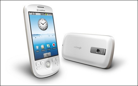
The HT-03A is wicked.
I downloaded and played "doom" (the original) on the train today - natsukashi. -
Couldnt get an iphone (the Boss made my stick to the docomo and the family plan) but, no matter this past Monday I bought the new release from docomo: the HT-03A better known as the "HTC magic".
It is a brilliant beast of a phone, the Google Android OS is very smooth and fast and the apps from the Android market are awesome and mostly all free.
Choosing between a iphone or this phone would be like choosing between a BMW or a Benz. Both are excellent.
Also it was really cheap to buy - only about 30000yen (or by installments) which is less than half the price of all the top line Japanese models now. All you can use internet for a shade over 5000yen a month.
The only problem is the battery - it drains fast,and it comes with a spare battery in the box. If you can live with that then you are golden.
If you are a docomo user who wanted an Iphone but didnt want to leap to Softbank, I recommend this badboy.

-
one of my friends updated his FB status today. Says it all really......
Quote:{insert name here] doesn't remember taking a space rocket anywhere but it does appear that he has woken up this morning ON THE FACE OF THE GOD DAMNED SUN!! At-f***ing-sui. -

she must have slipped.
-
follow his thoughts on twitter - it's about the only really useful thing about twitter - following a specific persons micro blog.
-
-
after toddler?
pre-schooler.
-
Originally Posted By: KintaroI don't necessarily associate it with low IQ's but it is absolutely irritating.
I was exaggarating a tad there - a heavy dose of satire*
I am pleased that I am not only one who is irked.
satâ‹…ire [sat-ahyuhr]
–noun 1. the use of irony, sarcasm, ridicule, or the like, in exposing, denouncing, or deriding vice, folly, etc.
2. a literary composition, in verse or prose, in which human folly and vice are held up to scorn, derision, or ridicule. -
It's one of my pet peeves on the computer: people who type LOL ad nauseum in forums, emails, IM's etc. Are people really that easily amused that they are genuinely 'laughing out loud' like a hyena at the merest frivolity or triviality?
Whenever I see LOL, it conjures an image in my mind the most ditsy, vapid, scattered brained teenage girl
Even worse are those who think it's funny to put a "z" and make it 'lolz' - that shows an even more deficient I.Q than the plain version.
Anyone else irked by the inanity and pure stupidity of all the 'lol-ers' and their nauseating abbreviation?
-
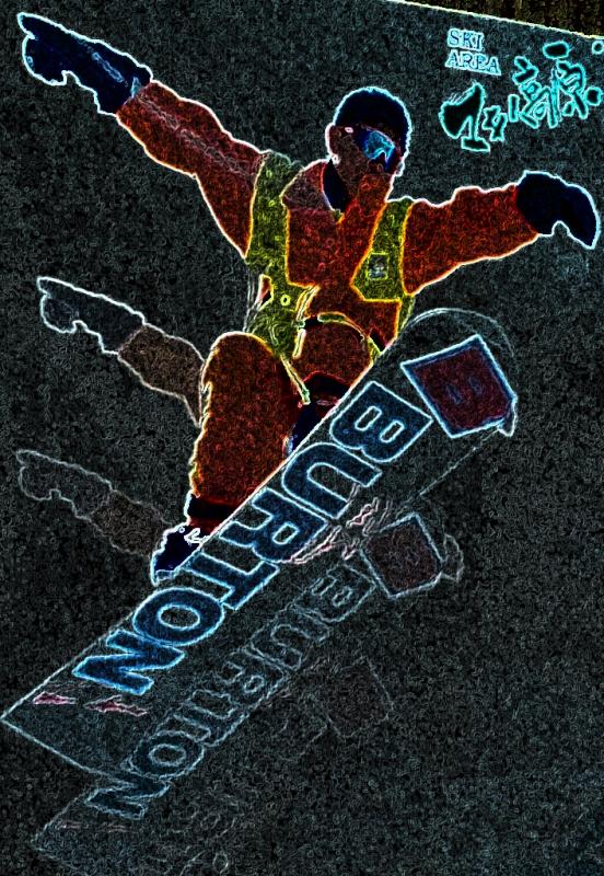
FWIW club fields are small and privately owned, most have rope tow lifts that are tricky to use (you attach yourself to the rope by means of a harness and connector called a nutcracker)
they are ungroomed and have minimal facilities - many have lodges to stay in and thats about it.
Some of them are awesome - steep sick terrain.
-
Originally Posted By: Go NativeStill really can't understand the whole concept of spending big $$$ on a [insert item here] or the need for one at all
insert item: jewellery, snowboard, skis, cellphone, cars, motorbikes, mtn bike, LCD TV, PS3, computer, jacket, shoes, handbag, ipod, overseas holiday, cigarettes, scotch whiskey, boat, jetski, purebred dogs, Bose earphones....
there is always something, different strokes for different folks
Quote:but hey if it makes you happy that's all that matters
exactly. -
2009 season looks to be on track at Mt Hutt at least.
snow has arrived well ahead of schedule for opening. May 15 would be the equivalent of November 15 in Hakuba...and look at what they have got!
No staff to run the place and yet to do the avie control so they cant open it up!

-
dragging up on old thread here...but just saw a classic name in a news story...
Tammy Womble the name of the neighbour at the end of this story.
Womble! good thing she lives in the USA and not a commonwealth country.
-
actually Stemik I was thinking the same thing and the watch he bought was ¥36,000 on the cheapest site listed on kakaku.com. So ¥35,000 at Yodobashi was cheaper than any net store listed on kakaku.
Not too shabby.
-
SH04 -thats the one I want - was looking at the blackberry Bold docomo have, but apparently this SH04 completely blows it out the water. Its not even a race.
-
-
I conked out at 9pm a few weeks ago and got a good 10 hours - sometimes your brain just says "F^&K IT!" turns French - goes on strike and shuts down.
At uni once, I was was absolutely knackered, had been studying hard, had a cold - crashed at 7:30pm on Sat night when my friends were about to go out drinking and woke up at midday the next day

The World's Most Hated FONT
in General off-topic discussions
Posted
back to fonts: I had a chuckle at the news Ikea changed their foh from Futura to Verdana...........................
IKEA has always used a modified variant of the Futura font in its catalogues and promotional material, but with the release of the latest catalogue, they switched to Verdana. The backlash on the internet is of almost epic proportions: typography geeks the world over are fuming over IKEA's change of fonts.
Typography geeks argue that Microsoft's Verdana is designed for on-screen use, and not for print materials. Futura is superior, according to them, so why didn't IKEA just use Verdana online, and Futura for print materials? "I shudder at the thought of hovering Verdana-emblazoned billboards and bus stop ads," Jamie Latendresse writes. "Ikea, stop the Verdana madness!" pleaded Tokyo's Oliver Reichenstein on Twitter. "Words can't describe my disgust," spat Ben Cristensen of Melbourne. "Horrific," lamented Christian Hughes in Dublin. The online forum Typophile closed its first post on the subject with the words, "It's a sad day." On Aug. 26, Romanian design consultant Marius Ursache started an online petition to get Ikea to change its mind. That night, Verdana was already a trending topic on Twitter, drawing more tweets than even Ted Kennedy.All this outrage over a font? For some designers, it's an issue of propriety — Verdana, which was invented by Microsoft, was intended to be used on a screen, not on paper. "It has open, wide letterforms with lots of space between characters to aid legibility at small sizes on screen," explains Simon l'Anson, creative director at Made by Many, a London-based digital-consulting company. "It doesn't exhibit any elegance or visual rhythm when set at large sizes. It's like taking the family sedan off-road. It will sort of work, but ultimately gets bogged down."
(See pictures of Microsoft.)
Carolyn Fraser, a letterpress printer in Melbourne, Australia, adopts a different metaphor to explain the problem. "Verdana was designed for the limitations of the Web — it's dumbed down and overused. It's a bit like using Lego to build a skyscraper, when steel is clearly a superior choice."
So, why is Verdana well-suited for on-screen use? "It has open, wide letterforms with lots of space between characters to aid legibility at small sizes on screen," explains Simon l'Anson, creative director at Made by Many, a London-based digital-consulting company, to Time Magazine, "It doesn't exhibit any elegance or visual rhythm when set at large sizes. It's like taking the family sedan off-road. It will sort of work, but ultimately gets bogged down."
It is argued that the switch to Verdana is done for cost-saving reasons; apparently, the font is better suited for internationalisation (use in different alphabets). This means IKEA can more easily use the same font across all the countries it operates in, which should save costs for the company.
Now, I'm sure many of you are wondering why this story is on OSNews. Well, we all use our computers quite regularly, so I'm sure many of you have your own ideas and preferences when it comes to the fonts you prefer to use on your computers - and I think it's interesting discussion material.
While I am a huge fan of Microsoft's Trebuchet MS (beautiful!) my actual on-screen font preference for user interfaces are some of the fonts Microsoft introduced with Windows Vista: Segoe UI and Consolas (the names more or less imply where they are used in Windows 7). Both of them were designed by Microsoft's Typography division specifically for their intended roles.
the above is posted in verdana - yes it truly is hideous isn't it?
 Typography geeks need to get out more.....